Web Design
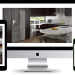
Aview Cabinetry
ContactLoft & Suite
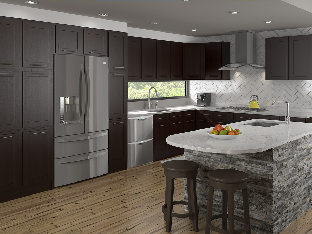
Aview multifamily solutions cabinets are all US-made using premium-grade materials and hardware. Cabinets from Aview define enduring beauty and utility.
The Aview Cabinetry website was one of my favorite projects from the entire time I worked at Universal Forest Products. At the time, it was one of the more recent brands that UFP had launched, and for sure the newest one in the modular cabinetry space.
Due to “modular” being in the brand description, I think it was in every way fitting that the creative director went the route of making it follow swiss design principles.
Aview Goes Swiss
The branding for Aview was actually done well before the site was, mostly due to the lack of time available to get started at the same time. But, having sat across from the designer that was making the logo, I had been contemplating what I could do for the site for a while.
It reminded me a lot of modern swiss design; between the simple shapes, the strong sans-serif type, and one-color design, it was wonderfully modernist.
If you don’t know what swiss design is, google that sh**. Right now.
Scaling Back
At the original concept, there was supposed to be a large product line, spanning many designs and sizes, so I immediately started drawing out home pages and product pages in variable styles.


Usually to hear that a concept is going to be less work than originally supposed to be is a good thing, but I was actually a little bummed that we’d only be doing a landing page. But, regardless, the brand had enough going on with it that it worked out just fine.
Easy To Build
Before the page was sent to the back-end developers for installation into the Sitecore CMS, I took a lot of time setting up a very simple style using very, very minor code. If it didn’t look like it would need it, it wasn’t added. No rounded corners, no soft edges.
I did add a decent amount of CSS animation during the last week of my build, so I suppose that retracts some of that “minimalism” feel, but compared to ProWood or Latitudes, this was definitely still the most minimal.
There are probably three sites that I look most favorably at when I think of my days at UFP, and this is definitely one of them.