Final Semester, 2011
NMU Art & Design Fundraiser
ContactI think it’s far less than secret, that I love wine. Well, maybe if you asked someone that hasn’t known me for 15 minutes. Otherwise, it’s a great motivator for my creativity.
The Backstory
Just before Apparitions — the senior show of my final semester — the DeVos Art Museum was putting on their annual Wine Fundraiser.
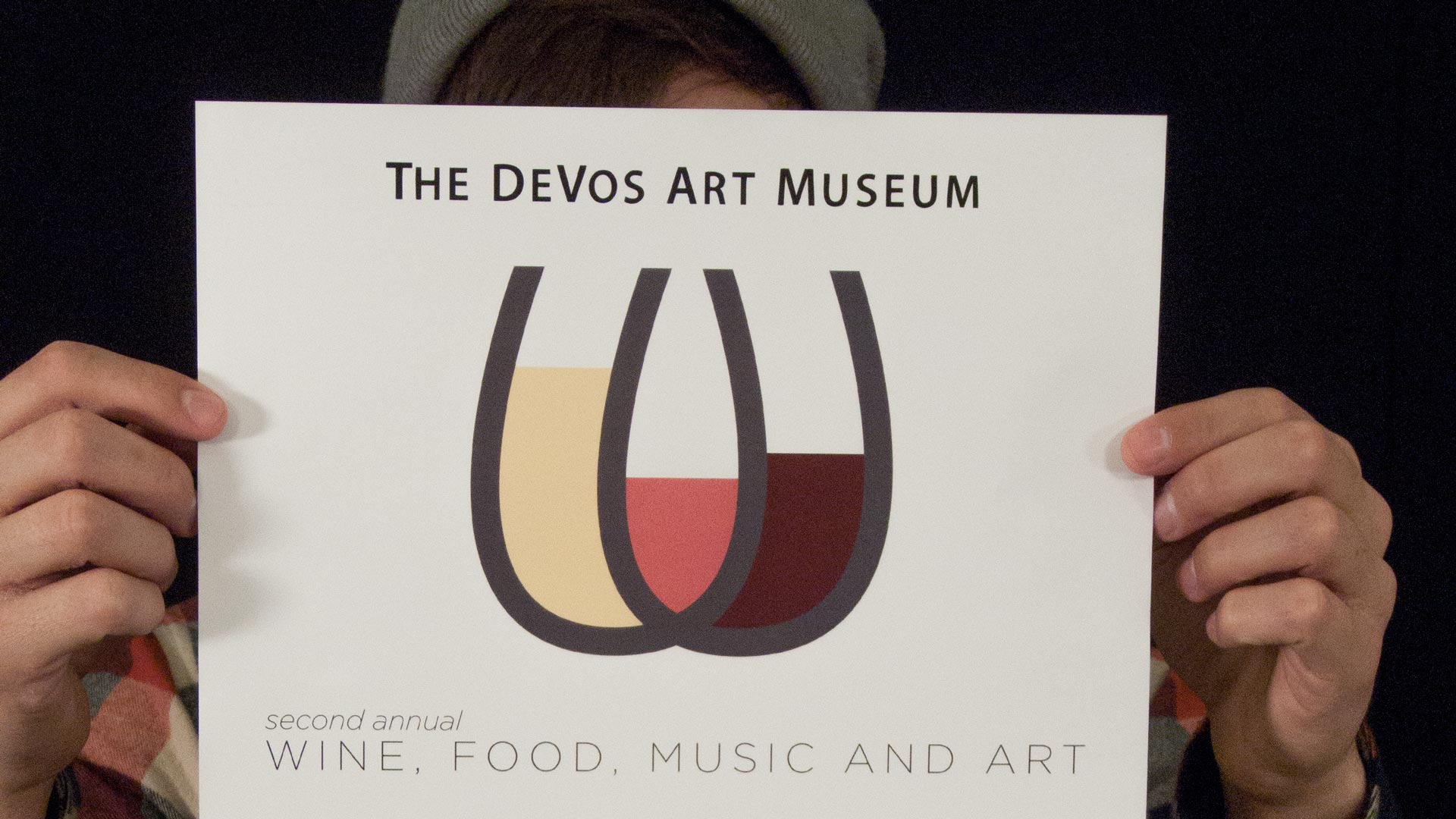
Every year they held a contest for the entire graduating class: design the coolest poster, and you get one of the few free $50 tickets to the actual fundraiser (worth about $5000 to a college student).

W / Wine
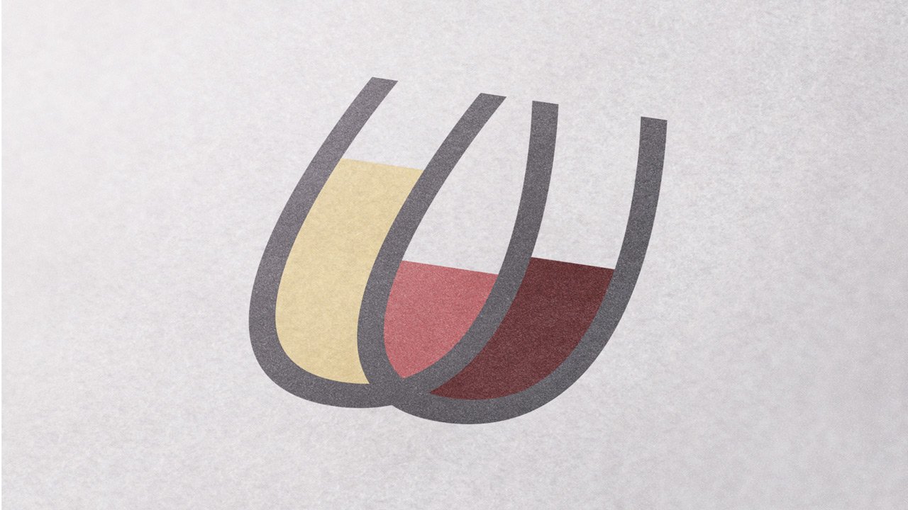
After having a solid creative block for a while, I ran across a typeface with some very curvy w’s. I realized then that a two wine glass could resemble a w if they were set to overlap, almost like a venn diagram.
Then, why not have them partially full? And show the different varieties? It worked out perfectly, since the rosé was a perfect in-betweener for a red and a white. Even from a small scale, it was easy to recognize it as both a letter and set of wine glasses.
[pullquote]Thankfully, the majority vote was on my poster, and that was one hell of a reception to go to.[/pullquote]
Accidental Nudity
Well, sometimes you accidentally create something you were never intending.
A couple years later, while showing a few logo marks I made to a friend, they noticed that it resembled … well, male genitalia. And once I saw it, I couldn’t unsee it.
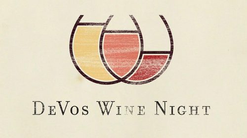
So, I thinned up the strokes, changed the wine levels, and added more curve to the glasses. Once I spent more time on it, I felt like it was in a place where that mistake couldn’t happen again. So now it looks like this, which I’m much happier with.

I feel like it’s not done either. Right now it was only used as the main identity for that one fundraiser, but I’d like to see it evolve past that. Stay tuned!