
Most people come to me looking for a logo.
(Most people leave with a whole lot more than that.)
Know What You’re Actually Ordering
Think of your brand like a cake.
Brand strategy is the recipe—your mission, values, and positioning that decide what you’re actually baking. Brand identity is the cake itself—the colors, typography, and style that come out of that recipe. And your logo is the cherry on top!
Most people come to me looking for just the cherry on top. That’s completely fine (I offer standalone logo work, and some of my favorite projects started exactly that way). But a cherry tastes a lot better with real cake underneath it. So no matter which one brought you here, I’ll make sure you know exactly what you’re getting, and what you’re missing.

Brand Strategy
The Recipe
Mission, vision, values, positioning. The decisions that determine everything else.

Brand Identity
The Cake
Creative direction, color, type, style. The system that makes your brand recognizable.

Logo Design
The Cherry
The mark on top. Sweet on its own, better with cake underneath.
A Few ”Fully Baked Recipes“
A brand only earns its keep if it holds up in the real world. Packaging, signage, screens, everything in-between.
-
Creative Director
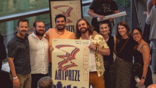
ArtPrize 16
Creative direction and design for the largest art festival in the Midwest

-
Brand Identity
Grand Rapids 175th Anniversary
I was commissioned by the city of Grand Rapids to create the logo for their 175th Anniversary

-
Brand & Website
Adrian & Blissfield Railroad
Creating a brand system that works for a railroad company, and yes, on the side of their trains

-
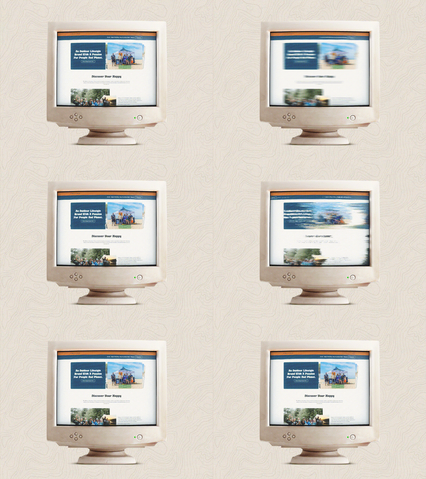
Brand & Website
Happy People Hike
Community events and cleanups with a 70's retro vibe
-
Brand Identity
VanderKodde Construction
Construction companies need a good brand identity to thrive as well

-
Brand Identity
Calder News
The best source of news & events happening in Grand Rapids

A peek into the design process
There is a lot of talk about AI “skipping” the traditional design process, but I believe that a thoughtful and human-centered approach is still essential for creating effective, meaningful, and beautiful designs.
Before Baking
Every project starts with questions, not a sketchbook. Who are you actually talking to? Who’s already doing this, and why aren’t they doing it well enough? What does “success” even look like a year from now? This is the unglamorous part—no mood boards yet, just honest conversation about your business, your audience, and what you’re really trying to pull off.
It’s tempting to skip straight to the fun stuff, but this is where the recipe gets written. Everything downstream—the colors, the type, the logo itself—only works if it’s built on a clear answer to “what is this brand actually for?” Skip this step and you end up with a good-looking cake that doesn’t taste like anything.
A Few Recipes
With the research in hand, I start sketching — but never just one idea. This phase is about exploring a handful of genuinely different creative directions, not polishing a single first instinct. Some will lean bold and graphic, some quieter and more refined, some weirder than you’d expect. The goal isn’t to find “the answer” yet—it’s to see the range of what’s possible.
You’ll see real options, not vague mood boards, and your reaction to each one tells me as much as the research did. Maybe you love the boldest one. Maybe the quiet one surprises you. Either way, this is where we figure out [together] which direction actually fits before either of us gets attached to anything.
Narrowing In…
Once we’ve picked a direction, the work flips from adding to cutting. This is where I tighten the color palette, dial in the typography, and sweat details most people will never consciously notice but will absolutely feel—spacing, weight, the exact shade of a color at 2pm versus 8pm light.
Refinement isn’t about chasing perfection for its own sake; it’s about making the final system feel inevitable, like it couldn’t have been any other way. By the end of this phase, there’s no more guessing—just a brand that’s been pressure-tested against real use cases, not just a pretty mockup.
Out of the Oven
You walk away with more than a logo file. You get the full system — guidelines, color codes, type files, usage rules — everything required to actually put this brand to work across business cards, signage, packaging, or a website, without guessing or re-asking me every time something new comes up.
This is the step most “just a logo” deals skip, and it’s exactly why they fall apart six months later. A brand only holds up if the person using it knows how. So by the time we’re done, you’ve got the cake, the cherry, and the recipe card taped to the fridge.
Are you in one of these industries?
My services are tailored to meet the unique needs of various industries, ensuring that you receive the most relevant solution to your specific needs/wants.


Don't Just Take It From Me
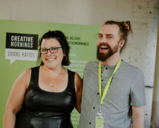
“Derek has an incredible ability to take a conversation about a concept and turn it into something tangible. I frequently will just explain to him our goals for a project and a general sense of the vibe and he turns that into colors, fonts, designs, and curates everything we need to make it happen.
– Alison Glowinski


Ready to build something?
Tell me about your project below.
